
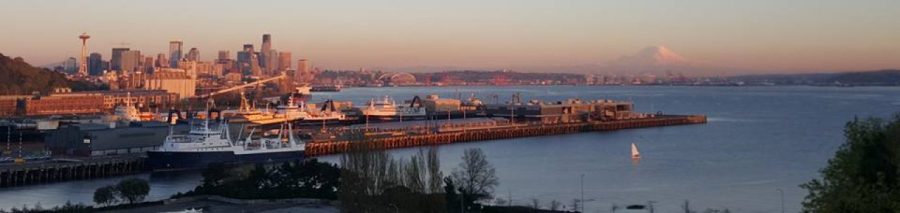
As Seattle’s booming economy grows, so does the feeling of instability felt by the city’s poorest residents. As rental rates and the cost of living increases, economically depressed areas within Seattle and it’s surrounding neighborhoods haven’t felt especially prosperous when compared to the stunning development seen in South Lake Union, Ballard and Fremont.
I think most people would generally agree that extreme inequality is not healthy for the long term health of a city. Consistent and concentrated inequality over enough time can lead to ghettos which are typically segregated not just by income, but also by race and ethnicity. These forgotten neighborhoods can develop into hotbeds of crime, which in turn can engender a poor relationship between rightly frustrated residents and a police force meant to clean-up neighborhoods. It likely only takes a few years for these neighborhoods to become labelled as slums by the general public and forgotten about by local government. When that happens, many of these communities are destined to devolve into poverty traps for generations.
I believe that with Seattle’s burgeoning wealth there is a unique opportunity to reverse long term poverty in our most risk neighborhoods. That being said, how can we identify an at risk neighborhood in Seattle? What indicators can we use to define these neighborhoods? And what then becomes an effective definition of poverty?
We all know that the east-side communities of Seattle (encompassing the uber rich cities of Sammamish, Redmond and Issaquah) are much more wealthy as compared to Seattle city proper. Here, visual maps of Seattle that are backed with hard data can provide a useful paradigm to frame our discussion.
I have decided to discuss three very specific economic indicators, all taken from a project I worked on for King County as a subcontractor to Intelligent Partnerships. This project described what the construction employment forecast looked like in Puget Sound Region and how subsequent construction employment through via King County could be targeted towards economically disenfranchised communities. The three indicators selected not only provided a framework to identify poor communities but were also selected because they formed the cornerstone for priority hiring statutes in California which were successfully defended in the California Supreme Court.
Please note that all the maps presented here are from the “Construction Workforce Analysis for King County and the Region” report prepared for King County and Intelligent Partnerships by Community Attributes Inc.
The first indicator I want to explore is a map of people below 200% of the federal poverty level per 100 acres. Here we can see the expected breakout of poorer households on the west-side in Seattle proper with little to no concentrations of poverty within east-side zip-codes. It is important to keep in mind that there are markedly fewer people living on the east-side, which in someways masks the concentration of poverty in those zip-codes. 
Next, lets look at zip-codes which have residents with no college degree per 100 acres. This map at first glance looks to be almost exactly the same as the previous map. This is of course only natural as we expect to see zip-codes with relatively few college degrees to be poorer than more affluent zip-codes. 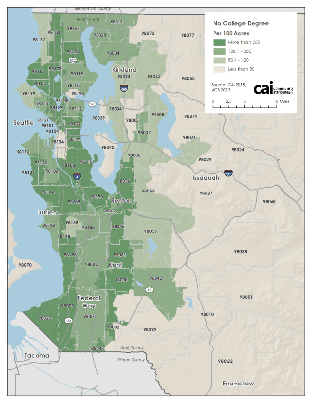
Lastly, I’d like to look at the unemployment rate by zip-code per 100 acres. Here we see that unemployment is centered around major employment centers, with concentrations and gaps in areas that largely match poverty areas as seen in the previous two maps. Of particular interest is zip code 98134, which is located in downtown Seattle. With fewer than three unemployed persons per acre, the area has one of the lowest unemployment rates within King County. This is almost certainly because this zip-code acts as a major employment center, but is not a significant housing center. 
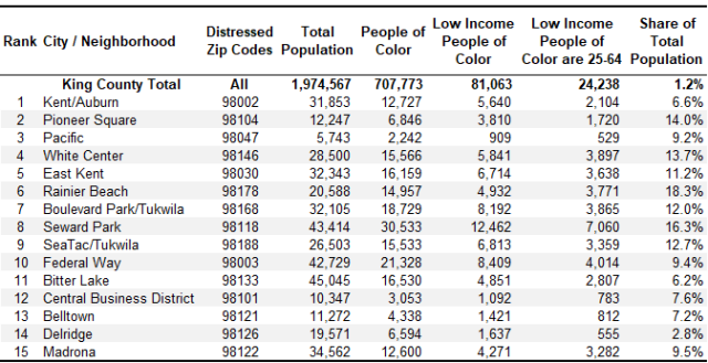
If we overlay these three metrics we are able to arrive at a interesting array of zip-codes that represent the most economically depressed neighborhoods within the Seattle metro area. Here we see the city’s distressed zip codes are composed of a larger share of working age persons of color with low income than King County. As a whole, approximately 24,200 working age residents out of just under 2 million reflect the intersection of low income, non-white or Hispanic, and working age groups. This accounts for roughly 1.2% of the total county population. The top 15 economically distressed zip codes presented below have higher ratios of ‘economic distressed-ness’; ranging from a low of 2.8% of residents in Delridge to a high or 18.3% of residents in Rainier Beach.
What this information tells us is that there are effective ways to identify poor neighborhoods in an analytically and legally robust way. I had previously used this data to compile a list of priority hiring areas for construction workers in economically disenfranchised areas of King County, but there is no reason why a similar system couldn’t be co-opted to more precisely target specific neighborhoods with social programs and to try and help the poorest Seattle neighborhoods.
If you are interested in seeing more of this work as it relates to the construction industry, please take a look at a copy of the presentation I gave to King County.
